Mar 8, 2016
Blog

Sometimes the simplest models are the best. When Nate Silver’s team at FiveThirtyEight sought to improve upon the Partisan Voting Index (which measures the Democratic vs. Republican performance of a district compared to Presidential results), they ran, “copious regressions,” but ultimately only adjusted one thing: wealth. A lot of math went into confirming the obvious – that poorer communities are more Democratic.
In the run up to Super Tuesday, many of the 11 states had poor-to-nonexistent polling, so I ran some simple numbers. This let me show each state’s particular breakdown of core Hillary voters (minorities and white moderates) compared to Bernie voters (Millennials and white fiscal liberals) who were 50% or more likely to vote (based on past behavior).
The math predicted 10 of 11 states correctly. Only Oklahoma bucked the trend, where moderate white voters went with Sanders over Clinton. AL, CO, GA, MA, MN, TX all saw final results extremely close to the “base coalition” calculations.
With five big time states heading to the polls on March 15, I built the same charts.You can read the full breakdown here on Medium.com. This is Ohio: 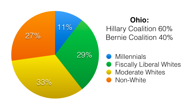
Brands, entertainers, sports franchises, and nonprofits can use the same process to easily understand their communities and engage them strategically. Most public affairs shops work closely with “influencers,” and that is highly valuable. But when you dive deeper in the data, we can better target entire communities. In the next few months we’ll be talking about our efforts here at DKC to apply world-class data and analytics to solve client challenges… without confusing their staffs.
Contributor: Mike Moschella, VP of Innovation