Dec 16, 2015
Blog

Share this Blog Post

How does one go about designing a logo for a top PR company whose clients range from government to Gaga?
BR&, the creative agency at DKC, was challenged with an interesting problem to come up with a memorable logo, one which would speak to a wide range of industries from entertainment to sports to public affairs.
After many rounds of sketching, refining, and eliminating, the final logo achieved this by pointing to the essence of public relations and media business.
The concept is simple: three circles are abstracted to show information emanating out from inside the core, creating a ‘ripple effect.’ The circle was an appropriate shape, supporting the idea of something ‘whole’ and ‘well-rounded’.
The team then followed up with supporting collateral designs and a full redesign of DKC’s website to launch in time to celebrate the company’s 25 year anniversary.
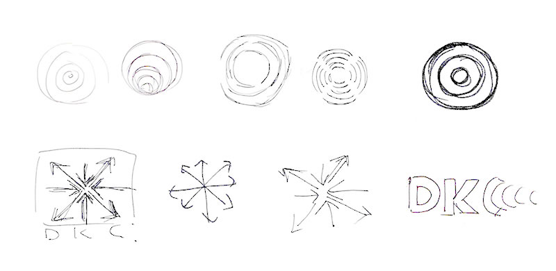
below: concept sketches showing idea of information emanating from the core.
far below: ‘ripple effect’ pattern used on various collateral.

